Why hello, my bro and i's t-shirt company is launching tomorrow! As in the website and online shop. Stay tuned for more info! Thank you.

 I made this for my brother's flag football team. Supposed to be for the jersey or shirt obviously. Not sure if they'll end up using this but I'm proud of my keg/ball nonetheless. Here's to you!
 Here is my Mammoth Root Beer that everyone seemed to love from a few semesters ago. At first, I didn't like the colors but they grew on me. I'm liking the black with ice now. Good Taste Never Goes Extinct.
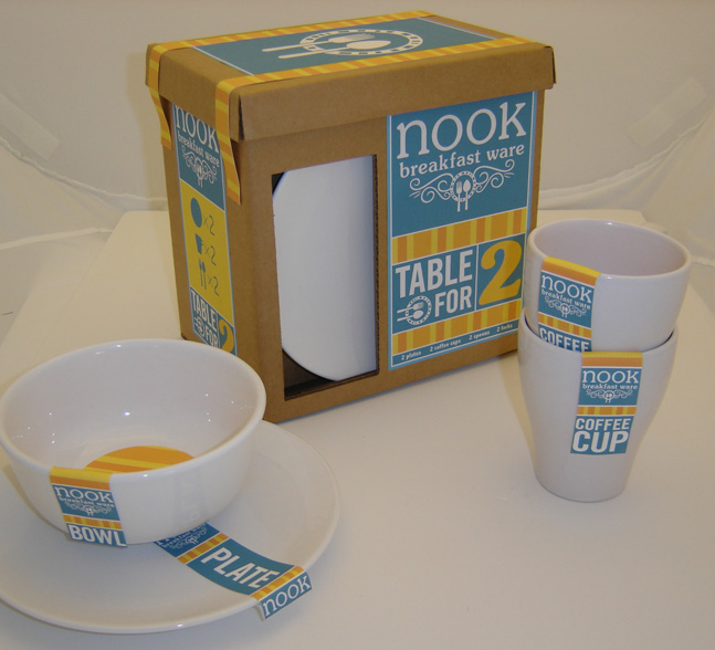 A project from last year for my package design class. This is the Table for Two set. Light blue and bright yellowish orange symbolize a sunny morning. I wanted the high contrast between the dull cardboard box and the shiny white plate. There's also a window in the other side that has a mug popping out. I'm pretty happy with it. Other possibilities for future installments were table for 4, 8, 12 etc...