[dirty digs spaceship]
 [j to the k... cover the bottom half, basically the chin down, and it sorta looks like jk]
It'll be a long while before i come close to topping the bear. (see last post again)
[dirty digs spaceship][j to the k... cover the bottom half, basically the chin down, and it sorta looks like jk] Finally something new! Drew this via Facebook's Graffiti application for a friend [Anna]. Dope thing about Graffiti is that you can watch how people draw their pieces from start to finish. Pretty cool. Cheers and good day to you!


 I made this for my brother's flag football team. Supposed to be for the jersey or shirt obviously. Not sure if they'll end up using this but I'm proud of my keg/ball nonetheless. Here's to you!


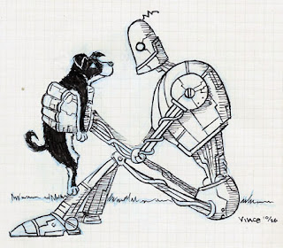
 chippity choppity chip

 I just really felt like I had to post something new. We're one third into May and my last post was back in April. And plus, I have nothing better to do right now.
 I don't hate it at all, but it isn't as strong as my first design. Looking back, my teacher dropped the ball big time. I shoulda pushed for it more. I will from now on.
 A little something I drew in my sketchbook out of boredom. It's another variation of my giant flying rhino. Textures and contrasts are fun!

 This is a poster for a play. It's a comedy about people in the not-so-distant future trying to cope with the electronic life that relies so much on material possessions. The simple llfe sounds really sweet right now. ps. i haven't been able to concentrate since coming back from the philippines a few weeks ago. At least i'm not sick anymore. God bless!
 I consider this to be my first real graphic design project. Done in my sophomore year right after I changed majors from animation to graphic design. I had major doubts about it at the time, especially since it was hand-done and a little rough around the edges, but this is one of those that sorta grew on me. I'm very glad that I, and my teacher, liked the outcome; otherwise, I don't know what career path I would have ended up in. Graphic design was very new and very foreign to me so I was shocked that people liked it.
 Here is my Mammoth Root Beer that everyone seemed to love from a few semesters ago. At first, I didn't like the colors but they grew on me. I'm liking the black with ice now. Good Taste Never Goes Extinct.
 My next project for Print Production is a posterized self portrait. This is the picture I'm gonna used and I added the birds in the window. The picture was taken on the way back to California from the Philippines last week. I miss last week. All I gotta do now is posterize it.
 And this is excerpt from my resume. A sort of a teaser for my portfolio. I really like the crop.
 Another old idea from a couple years ago revamped. I did this for silkscreen printing class. That's Arnold schwarzenegger for those few who can't tell or don't understand it. I like it very much. don't be economic girlie men!
 I decided to put a little more thought into my character collage. I reworked the placement and the color. Turtle turtle has multipled so it seems. The real printout is a whopping twenty four by thirty six. Thank God for adobe illustrator.
 This is the final for my tree ape in all it's silkscreen glory. I tweaked the colors in photoshop a bit, otherwise, I'm pretty happy with it. Of course, it looks better in person cause it is silkscreen. I have nothing much else to say. Project number two is a skeleton. ohh to the ahh!

 This is my shirt design for my school's tee shirt contest. I wasn't planning on designing an entry but one of my professor made it a manditory assignment. I trashed many ideas so this idea was pretty last minute. Literally. I kinda like it overall but I don't expect much from this. And, yeah, I know my kerning needs some work in a few places.
 I took my tree ape a bit further by adding a lot more detail. Instead of being round, he has hair sticking every which way. The tree is drastically different and more fitting with the ape. I consider it to be one of the best trees i've ever designed. The colors are pretty much final. Hopefully I can mix the inks correctly. The arm position changed so it isn't as confusing. A banana belly has been added as well. And I also added birds in the sky... It's like the tree ape took their spot and they have nowhere to go. It's hard to tell but those birds are pissed. ooh to the ahh!
 I'm taking a silkscreen printing class this semester. This is the stencil for my first project. There are actually three parts to it. First I will apply a photo emulsion of cotton swabs in the background in a very light faded yellow or off-white. Secondly, I will block out the screen with ripped paper to make the leaves and grass. The ripped paper will give it the right texture. The color for that wil be a muddy or olive green. The last step is the actual stencil that i have to cut out. The stencil will be of the monkey and the tree bark which will end up being a dark to medium brown.
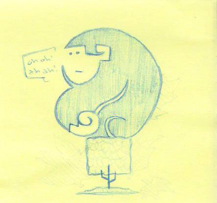 My other idea was a really graphic overhead view of a mouse in a maze with cheese at the end. I'm glad i stratched that idea.
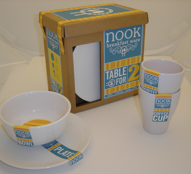 A project from last year for my package design class. This is the Table for Two set. Light blue and bright yellowish orange symbolize a sunny morning. I wanted the high contrast between the dull cardboard box and the shiny white plate. There's also a window in the other side that has a mug popping out. I'm pretty happy with it. Other possibilities for future installments were table for 4, 8, 12 etc...